Have you ever finished a crochet or knitting project only to feel underwhelmed by the colors? Maybe the stripes clashed, the variegated yarn turned muddy, or the whole piece just… disappeared into the background. You’re not alone. Many crafters—yes, even experienced ones—choose yarn based on what “looks pretty on the shelf,” only to be disappointed when the colors don’t sing together in the finished piece.
But here’s the good news: color isn’t magic—it’s a learnable skill. And you don’t need an art degree to master it. By understanding a few simple principles of color theory, you can confidently select yarn palettes that pop, tell a story, and make your handmade projects look professionally designed—even if you’re stitching from your couch with your morning coffee.
In this guide, we’ll break down the fundamentals of color theory as they apply to yarn, explore classic and modern palette formulas, share real-world tips for testing combinations, and help you avoid common pitfalls (like “muddy” neutrals or overwhelming hand-dyed skeins). Whether you’re making a granny square blanket, a colorwork hat, or a gradient shawl, these tools will transform your color confidence.
Let’s turn your next project into a visual masterpiece—one stitch at a time.
Why Color Theory Matters in Yarn Crafts
Color is often the first thing people notice about your work. A well-chosen palette can elevate simple stitches into something eye-catching, while a poorly matched set can make even intricate lace look dull or chaotic.
Unlike painting, where you mix pigments, in fiber arts you’re combining pre-dyed fibers—so you need to “see” how colors interact before you commit. That’s where color theory comes in: it’s a roadmap for predicting how hues will behave side by side.
Real impact: A baby blanket in soft coral, cream, and sky blue feels warm and soothing. The same blanket in neon green, hot pink, and black? Jarring—even if the stitches are perfect.
The takeaway: Color carries emotion. Choose it with intention.
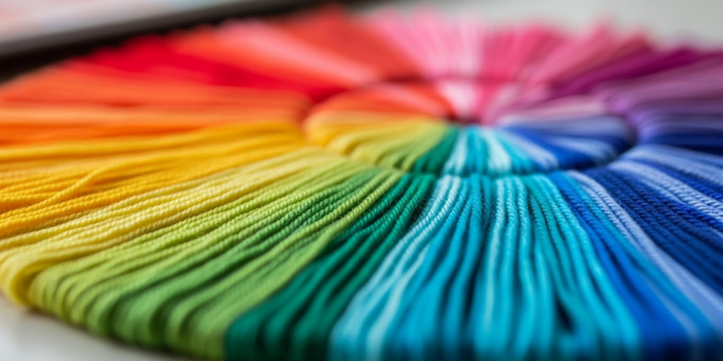
The Color Wheel: Your Secret Weapon
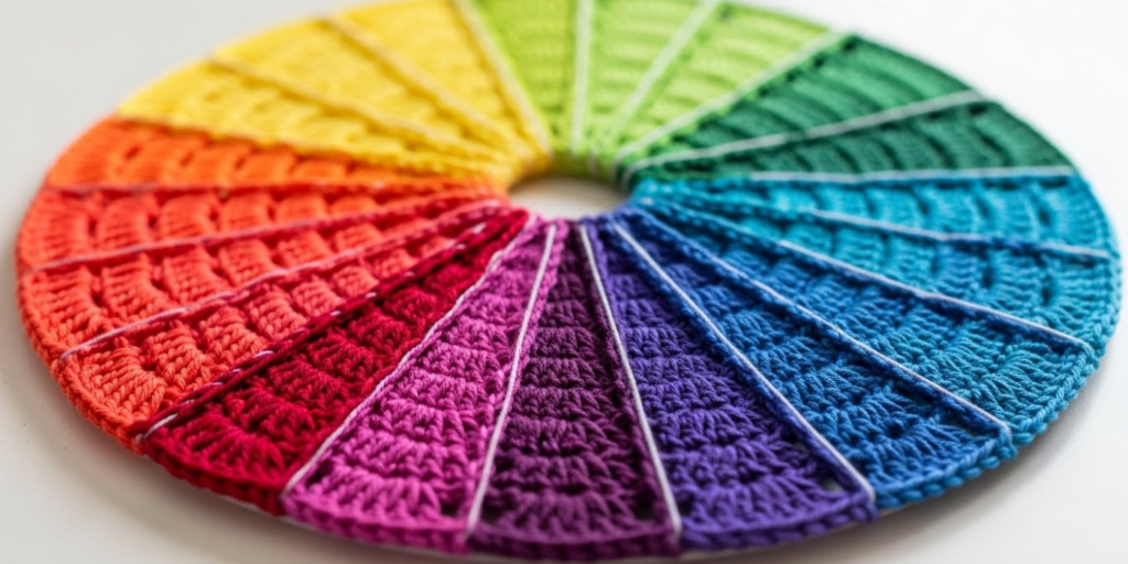
At the heart of color theory is the color wheel—a circular diagram showing how hues relate. For yarn crafters, the 12-hue RYB (Red-Yellow-Blue) wheel is most useful. Here’s how to use it:
- Primary colors: Red, yellow, blue (can’t be made by mixing others).
- Secondary colors: Green, orange, purple (mix of two primaries).
- Tertiary colors: Red-orange, blue-green, etc. (mix of primary + adjacent secondary).
Now, the magic happens with relationships on the wheel:
1. Complementary Colors (opposites)
Example: Blue + orange, red + green.
→ Creates high contrast and energy. Great for bold accessories or holiday projects.
Tip: Use muted versions (like navy + terracotta) to avoid visual vibration.
2. Analogous Colors (neighbors)
Example: Blue, blue-green, green.
→ Harmonious and calming. Ideal for wearable garments or baby items.
Bonus: Add a neutral (like cream or gray) to keep it from feeling monotonous.
3. Triadic Colors (evenly spaced trio)
Example: Red, yellow, blue.
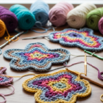
→ Vibrant but balanced. Works beautifully in granny squares or toys.
Caution: Use one as the dominant hue, others as accents.
Pro move: Take a photo of your yarns together and convert it to grayscale on your phone. If the shades blend into one blob, they lack contrast—add a darker or lighter tone.
Understanding Value, Saturation, and Temperature
Color isn’t just about hue—it’s also about lightness, intensity, and warmth.
- Value = how light or dark a color is.
→ Why it matters: Low-contrast palettes (all medium tones) look muddy. Mix light, medium, and dark for depth.
→ Try this: Arrange your yarns in a line from white to black. Are they evenly spaced? If not, add a lightener or darkener. - Saturation = how bright or muted a color is.
→ Neon yellow vs. mustard yellow are the same hue, different saturation.
→ Rule of thumb: Pair high-saturation colors with neutrals (e.g., emerald + oatmeal), or mix muted tones for sophistication (dusty rose + sage). - Temperature = warm (reds, oranges, yellows) vs. cool (blues, greens, purples).
→ Warm palettes feel cozy and energetic; cool ones feel serene and modern.
→ Watch out: Mixing warm and cool versions of the “same” color (e.g., warm gray vs. cool gray) can create unintended clashes.
Real example: A shawl in cool lavender, teal, and silver feels oceanic and elegant. The same pattern in warm lilac, turquoise, and bronze? Totally different mood—earthy and autumnal.
Working with Variegated and Self-Striping Yarns
These “magic” yarns are popular—but tricky. A poorly chosen variegated yarn can create “pooling” (large blocks of one color) or visual noise.
How to tame them:
- Pair with a solid: Choose a solid that matches the lightest, darkest, or most dominant color in the variegated skein.
→ Example: A rainbow yarn? Pair with navy (darkest) or cream (lightest) for balance. - Check the repeat: Unwind 2–3 yards to see the color sequence. Will it stripe evenly or create large blobs?
- Avoid “muddy” variegates: If the yarn has too many closely related tones (e.g., five shades of brown), it can look dull. Look for clear contrast within the skein.
Pro tip: Use variegated yarn for the main field and solids for borders or accents. This contains the chaos and adds structure.
Building Your Own Perfect Palette: A Step-by-Step Guide
Ready to create a custom combo? Follow this foolproof method:
Step 1: Define the project’s purpose
- Is it a gift? For a baby? A statement garment?
- This sets the mood: playful, serene, dramatic, etc.
Step 2: Choose your anchor color
Pick one yarn you love unconditionally. This is your starting point.
Step 3: Add contrast
Select a second color that differs in value (light/dark) or temperature (warm/cool).
→ Example: Anchor = medium sage → add deep forest green (value) OR soft coral (temperature).
Step 4: Bring in a neutral
Cream, gray, taupe, or even black/white can “rest the eye” and tie everything together.
Step 5: Test before you commit
Wind small amounts into a ball and stitch a 4″ swatch. View it in natural light, artificial light, and at a distance.
Palette formula cheat sheet:
- Cozy & Calm: Analogous + cream
- Bold & Modern: Complementary + black
- Earthy & Rich: Triadic muted tones + taupe
- Festive & Fun: Primary colors + white
Common Color Mistakes (And How to Fix Them)
Even experienced crafters stumble. Avoid these pitfalls:
❌ Too many brights: Three neon colors compete for attention.
✅ Fix: Use one bright as the star, others as accents.
❌ All neutrals with no contrast: Beige, tan, and oatmeal blend into “beige soup.”
✅ Fix: Add a dark neutral (charcoal, espresso) or a pop of color (rust, olive).
❌ Ignoring skin tones: A shawl that looks gorgeous on the shelf might wash out the wearer.
✅ Fix: Hold yarn near your face in natural light. Does it brighten your eyes? If not, keep swatching!
❌ Forgetting the background: A red blanket on a red couch disappears.
✅ Fix: Consider where the item will be used—choose colors that stand out in their environment.
Tools & Resources to Boost Your Color Confidence
You don’t have to guess! Use these free (or affordable) tools:
- Adobe Color: Upload a photo (a flower, a painting, a landscape) and extract a palette.
- The Purl Bee’s Yarn Palette Generator: Filters by brand and fiber.
- Pinterest: Search “yarn color palette [project type]” for real-crafter inspiration.
- Physical tools: A $10 color wheel from an art store is worth its weight in gold.
Pro habit: Keep a “palette journal”—swatch new yarns and note what they pair well with.
Color as Self-Expression
At its best, color choice is deeply personal. Maybe you love unexpected combos (mustard + plum!), or maybe you’re drawn to monochromatic gradients. There are no “wrong” choices—only choices that don’t serve your vision.
Remember: Some of the most iconic fiber art pieces break traditional rules. The key is intention. Know why you chose those colors, and your work will have soul.
Conclusion: Paint with Yarn, Not Just Stitches
Mastering yarn color theory isn’t about rigid rules—it’s about seeing, experimenting, and trusting your eye. With a little knowledge and a lot of curiosity, you can move from guessing to confidently curating palettes that enhance your stitches, reflect your style, and bring joy to everyone who sees (or wears) your work.
So next time you’re at the yarn store, don’t just grab what’s pretty—ask: What story does this color tell? How does it feel next to that one? Does it sing—or whisper?
Start small. Swatch boldly. And remember: every great colorist was once a beginner with a tangled skein and a dream.
Now we’d love to hear from you: What’s your go-to color combo? Or which palette have you been too scared to try? Share your thoughts, photos, or questions in the comments below—your idea might be the spark someone else needs to create something beautiful! 🌈🧶

Maria Santos is a dedicated crochet and knitting enthusiast who finds joy in turning simple strands of yarn into meaningful, handmade art. With a natural eye for detail and a deep love for fiber crafts, she brings warmth, creativity, and years of personal experience to every project. Maria is inspired by the stories woven into each stitch and loves sharing that passion with others.